A/B Testing with App Service, Part 3: Analyzing the telemetry
This is the third article in our guide for A/B testing with App Service. The first article shows how to set up your client-side project. The second article shows how to configure your backend.
Share your thoughts in the comments section.
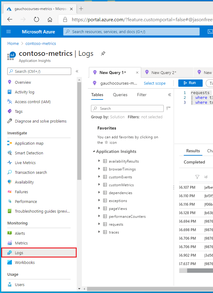
Now that our client-side and backend projects are configured, we can analyze the data and compare results using Application Insights. Open the Azure Portal and open your Application Insights resource that you created in the first article. On the left side, open Logs under Monitoring.
Example 1: Comparing request duration
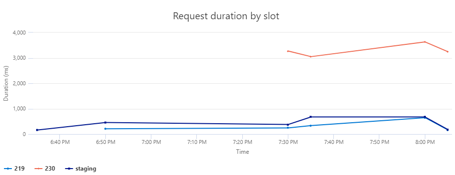
This example will show three slots. The staging slot is where our main branch is deployed to every time there is a push to the main branch. The other two slots, labeled 219 and 230, are both pull requests targeting the main branch. We are using App Service’s deployment slots as a staging environment to deploy the pull requests on so we can test them before merging.
Our goal in this example is to compare the average request durations for an important API call in the application. If we identify that one of the pull requests regresses the performance of that API, then we can investigate the PR’s changes more closely so we don’t regress performance in production.
The query
Let’s walk through the query step-by-step. We will use the dependencies table which shows outbound calls from our client-side application. Next, create two columns using the extends command. The first column, time_bin, bins the timestamp into 5 minute windows which makes our data less noisy. The other column, slot, parses the slot name from the customDimension column.
dependencies
| extend
    time_bin = bin(timestamp, 5m),
    slot = tostring(parse_json(customDimensions).slot)
We will also specify a time window of 24 hours, and filter the rows to show only POST calls to /api/flights/reserve. You can expand or narrow the time window depending on the amount of telemetry your application emits. And you should also change the API path to a valid request in your application. On the last line, project drops all columns except for slot, time_bin, and duration.
| where timestamp > ago(24h)
  and name == "POST /api/flights/reserve"
| project slot, time_bin, duration
Before we render the timechart, use the evaluate pivot(..) command to rotate the table by turning the unique values in the slot column into multiple columns. This command will also take the average request duration by each time_bin and slot.
| evaluate pivot(slot, avg(duration))
| render timechart with ( title="Request duration by slot")
The graph
When the query is executed, you should get a graph similar to the one shown below. Each line represents a deployment slot. The y-axis shows the request duration, and the x-axis shows the time. In the example shown below, we can see that customers that are routed to the slot “230” are experiencing very long request durations. Knowing this, we can investigate the changes in that Pull Request and fix the problem before merging.
Example 2: Comparing custom metrics
You can use Application Insight’s telemetryClient.trackMetric() and telemetryClient.trackEvent() methods to track custom metrics and events. In this scenario, we are emitting a custom metric to track the average duration of a database query in milliseconds. You could also track the time spent for other backend operations, such as heavy data processing or I/O operations.
The query
Your custom metrics are tracked in the customMetrics table. The first step is to filter the custom metric rows to the metric of interest, which is query_time in this case. Like before, create a new column, slot, from the customDimensions table. Next, take the average value for each slot.
customMetrics
| where name == "query_time"
| extend slot = tostring(parse_json(customDimensions).SLOT_NAME)
| summarize avg(value) by slot
The final step is to render a bar chart and clean up the labels. The order by slot ensures that the bars of the bar chart are always rendered in the same order.
| order by slot
| render barchart with ( title="Average query time by slot", ytitle="Query time in ms", xtitle="Slot name")
The graph
Similar to the previous example, this chart shows us that Pull Request 232 is greatly improving the query performance under real-world traffic. This is a good sign, and gives developers or QA teams another data point for the PR review process.

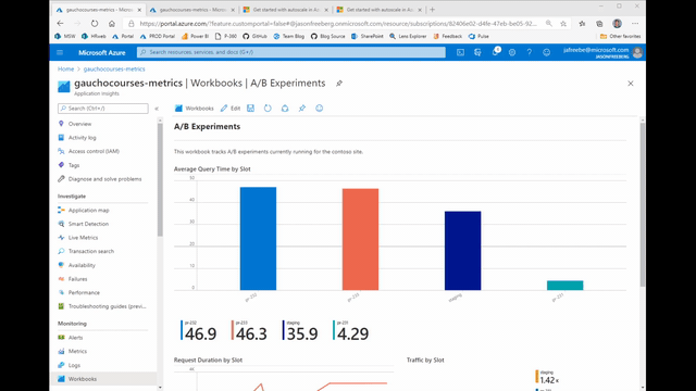
Monitoring dashboards
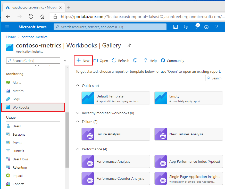
You can use Azure Monitor Workbooks to monitor your experiments and quickly gauge results across your queries. To get started, open your Application Insights resource in the Portal and open the Workbooks blade. Then click + New.
The workbook will open with a default Markdown section and graph. Click the Edit button below the graph and paste one of the earlier queries. Click Done Editing at the bottom to save the query. You can also annotate your workbook with notes, links, and lists using Markdown.
Leave a comment