⭐Reviewing inference results
1. Use the visualization page
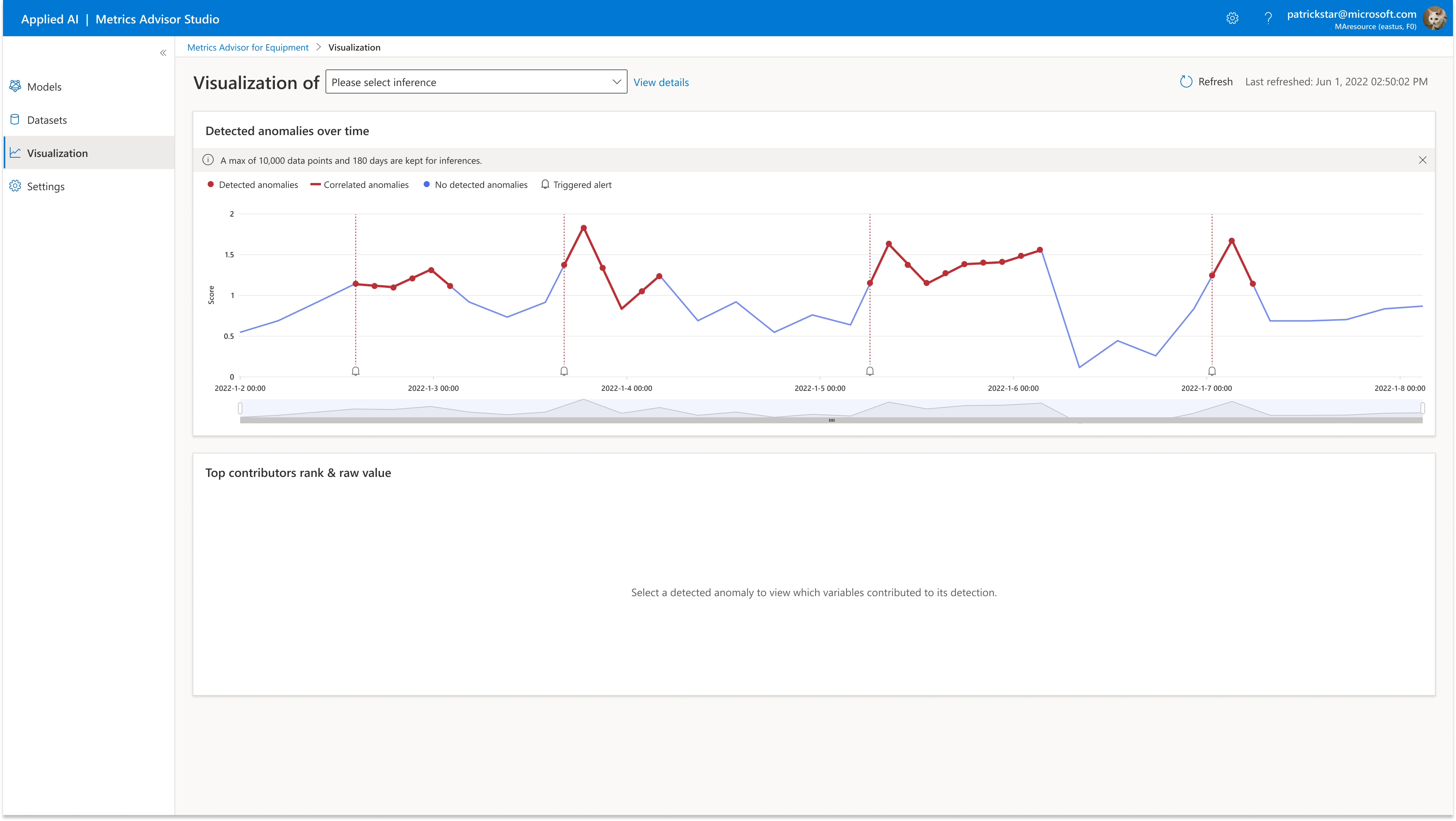
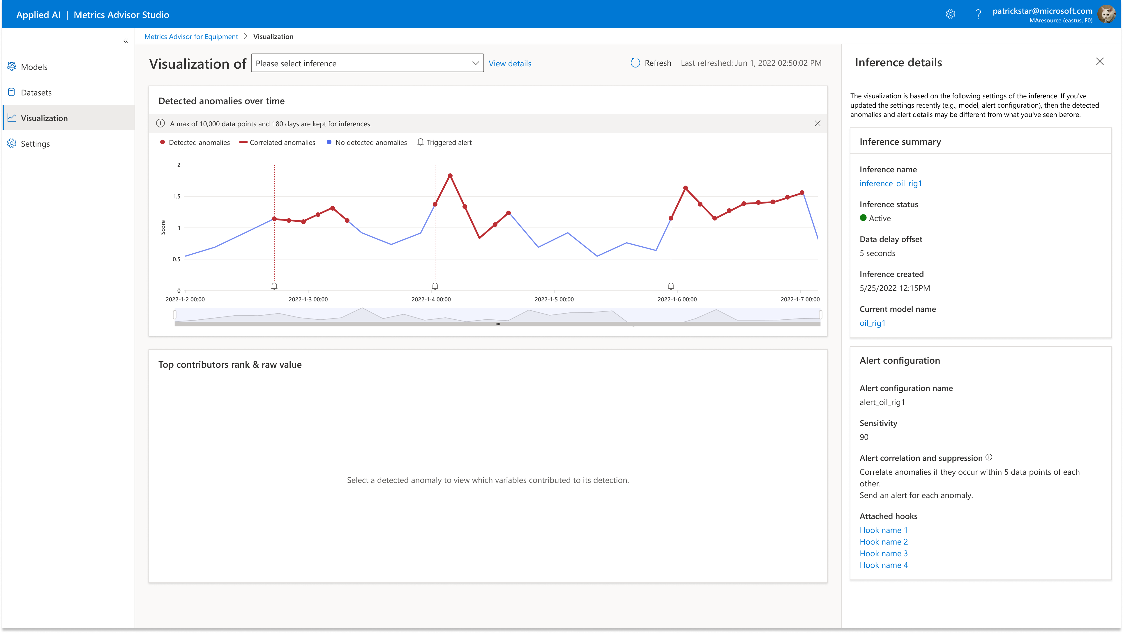
On the visualization main page you'll find your inference list, both active and inactive.
A max of 10,000 data points and 180 days are kept for inferences.

On the right panel detail page you'll find details about the inference summaries. You'll also find alert configurations about the inference itself.

2. Anomaly score
Equipment anomalies and health trend means the results from the most recent inference run. These results provide information about anomalous behavior that occurred over the past 300 points.
Use the slider to zoom in on a particular event.
Click on a particular event (red bar) to view details about it.
-
Anomaly scoreis the raw output of the model on which the model makes a decision.Anomaly scorewill have a value from 0-1.78.Anomaly scoreusually will indicate a anomaly rise or decline respectively. -
Anomalyindicates an anomaly at the current timestamp. -
Not Anomalyindicates the current timestamp is not an anomaly.

3. Top 5 contributors
After you click on a particular event, the Event details tab indicates which sensors contributed the most to that event. Users can select top 5/10/15 contributors at one time from dropdown.
contributorsis a list containing the contribution score of each variable. Higher contribution scores indicate higher possibility of the root cause. This list is often used for interpreting anomalies as well as diagnosing the root causes.
For contribution score color scale:
-
0<x<=25%: lightest
-
25%<x<=75%: medium
-
75%<x<=100%: darkest
NOTE: Metrics Advisor for Equipment will pull 300 data points for each variable when users clicked on an anomalous point, show top 5 contributors by default.