Introducing Failure History (appLens) for Azure App Service Web App
“Why was my Web App down?” is the million-dollar question that usually follows with more questions than answer, for example: “Was it cloud provider issue?”, “Was it a deployment I rolled out?” “Was it just abnormal increase in traffic? etc. Getting to the bottom of the issue requires tedious activities like pulling off few logs, aligning them with correct times or even calling Support for help, and this is just first layer of investigation a.k.a “Isolation” or “Peeling the onion”. This process should not take hours and we agree! Introducing Failure History (appLens) for Azure App Service Web App: A tool to visualize various data points in few seconds!
What is Failure History?
Let me start with little background on the project. Project’s code name is MDH (Make David Happy). David is our rock star engineer (@Lamboin) who spends his day working on customer reported issues. He is the one who tries to answer the million-dollar question for our customers (“Why was my Web App down?”). We watched him pull variety of logs, overlay them and then align the time frames to get the 1st level of isolation. This process was MDS (Making David Sad), and that was one of the inspirations to kick start this project. Failure History (appLens) is an attempt to solve problem described above. It is self-service RCA tool that helps you visualize variety of data points in your web app life cycle in matter of seconds. This visualization helps answer the questions that usually follow our million-dollar question.
How it works
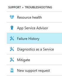
Failure History (now known as AppLens) can be accessed from “Settings” blade for your Web App.
With current release Failure History (appLens) focus on 3 core data points, which are
- Availability
- Requests and Failures
- Deployments
Let’s drill down on each of them with a real life examples.
Availability
This an overlay chart of 2 distinct data points, Organic availability and Container Health (Canary Web App).
Organic availability is an aggregated data points of successful HTTP requests vs. Failed HTTP requests to your web app. On the other hand Container Health (Canary Web App) is an aggregated data points of successful HTTP requests vs. Failed HTTP requests to a static page that resides inside same VM (container) as your web app. Both of them are weighted number in percentage. To learn more about the Canary Web App, please read “Resource Health Check” section of my previous blog.
I call this chart “Is it me? vs. Is it you?” chart. This literally is best way to isolate application issues vs. platform issues. This chart tries to answer “Was it cloud provider issue?” question.
- If you see Organic availability chart taking a dip while Container Health chart is at 100% then it surely is an application issue.
- If you see Organic availability chart taking a dip as well as Container Health chart taking a dip then it is most likely platform issue (App Service issue). The reason I say “most likely” is because, a bad web app in app service plan can potentially freeze the container and cause Container health chart to take a dive.
To see individual charts at appropriate scale I recommend you filter out an individual graphs by selecting them using radio buttons. Canary Web App concept is NOT applicable to FREE and SHARED web apps and hence that data will be missing for them.
Scenario 1: Platform issue
 ]
]
Scenario 2: High load freezing VM

Requests/Failures
This is an aggregated data points of total incoming HTTP requests vs. Failed HTTP requests to your web app. This chart can be used to answer “Was it just abnormal increase in traffic?” question. If you see drop in Organic availability chart (right above this chart) following large increase in Total incoming HTTP requests (HTTP Requests counter) then you can conclude that downtime could be related to increase in traffic and maybe I should consider turning on Auto Scale. You can also use this chart to answer “What % of my traffic was failing?” question.
To see individual charts at appropriate scale I recommend you filter out an individual graphs by selecting them using radio buttons
Scenario 3: Increased traffic causing scale out
![traffic_Increase_thumb[1]](https://azurecomcdn.azureedge.net/mediahandler/acomblog/media/Default/blog/a14249d7-a391-4be3-9ba3-33b51b45f348.jpg)
Deployments
This is simple data point indicating time frames when you or someone in your organization did deployment to your web app. This chart tries to answer “Was it a deployment I rolled out?” question.
This only shows deployments done via web deploy or Kudu endpoint. It does not cover deployments done using FTP. This is a great data point to co-relate with availability charts and see if Organic availability tanked right after the deployment? This way you can be sure if availability drop is related to your deployment or not.
Scenario 4: Bad deployment

Finally, few disclaimers for this version of Failure History (appLens):
- Failure History (appLens) data is at least 15 minutes behind. For issues that are currently happening and you need help then please use our troubleshoot blade.
- Failure History (appLens) data can go back 7 days to RCA (root cause analysis) issues that happened in past
- Failure History (appLens) defaults to UTC time